You’ve nailed your creative idea and mapped out your media plan. Including Out of Home (OOH) advertising was a smart move—but now comes the execution. To truly maximise your campaign’s impact, your OOH assets need to be visually compelling, strategically designed, and easy to process at a glance.
Whether you’re launching your first OOH campaign or refining an existing one, this guide will help you design attention-grabbing, high-performing outdoor ads.
Start with Strategy: Define Your OOH Objective
Before you even open your design software, get crystal clear on your objective. Are you looking to:
-
Drive brand awareness?
-
Build product consideration?
-
Support a new product launch?
-
Reinforce your brand at a specific lifecycle stage?
Your design choices should all trace back to this core goal. A single-minded focus helps avoid clutter and ensures your message lands effectively with your audience.
Design for the Real World, Not Just a Screen
OOH ads aren’t consumed on static screens—they’re seen at speed, from a distance, in varied lighting, and sometimes only for a few seconds. So, test your ad in context.
Use tools like the Clear Channel Playground or other virtual mock-up platforms to preview how your poster will actually look on a bus stop, billboard, or roadside panel. This step is key to refining visibility, contrast, and layout for real-world conditions.
The 4 Golden Rules of OOH Design
At Focus Media, we use a straightforward framework for crafting powerful outdoor ads:
Simple. Striking. Succinct. Sensible.
Let’s break them down.
1. Simple: Focus on One Clear Message
OOH isn’t the place for long copy or multiple CTAs. Great outdoor designs are built around one strong image, one headline, and one key takeaway.
According to Talon’s Creative Canvas study, simple poster designs command more attention than busy ones. Especially in Digital OOH (DOOH) campaigns, you can rotate through different messages over time—but each creative should communicate just one idea.
💡 Pro tip: Fresh DOOH creatives can boost memory encoding by up to 38% (QMS Insights).
2. Striking: Be Bold, Be Visual
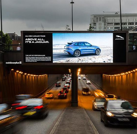
Great OOH advertising stops people in their tracks. Use bold colours, high-resolution imagery, and strong contrast to ensure visibility. Large typography, minimal clutter, and visual consistency with your brand assets go a long way.
-
Roadside ads? Use bigger fonts and high-contrast visuals.
-
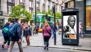
Transit panels or pedestrian sites? Consider more detailed images but still keep it focused.
Make your visuals work just as hard as your copy—they should attract, not distract.
3. Succinct: Less Is More
Keep your copy short and sharp. The shorter your message, the faster it’s understood—and remembered.
Posterscope research shows that shorter copy and optimised logo size are two of the biggest factors in increasing brand impact in OOH. Stick to a headline under seven words if possible, and make your call to action easy to find.
4. Sensible: Use Smart Composition
Good design flows logically. Viewers read left to right, top to bottom—so structure your content accordingly:
-
Lead with an image to draw attention
-
Place your message where it can be easily read
-
Position your logo where it will be remembered
For younger brands especially, increasing the size and prominence of your logo can significantly boost brand recall.
Real OOH Success Starts With Smart Design
The best OOH advertising campaigns start with a clear goal and end with well-executed creative. Keep it simple, bold, brief, and structured—and always preview your designs in context before launch.
📍 Interested in booking premium bus stop advertising in the UK? Visit www.focusmediauk.com/bus-stop-advertising to learn more and get started.