You’ve mapped out your media plan and made a smart, strategic choice by investing in Out of Home advertising (OOH). But now comes the creative bit—how do you design an outdoor ad that really performs?
Whether you’re new to the OOH space or looking for a creative refresh, these best practices will guide you through making powerful, memorable, and effective visuals for outdoor media.
Set Clear Objectives First
Before designing your first pixel, ask: What should this ad achieve?
-
Are you aiming to boost brand recognition?
-
Drive product awareness?
-
Nurture customers through a particular lifecycle stage?
Your ad’s structure and messaging should be rooted in this goal. This isn’t just a design task—it’s a strategic communication decision.
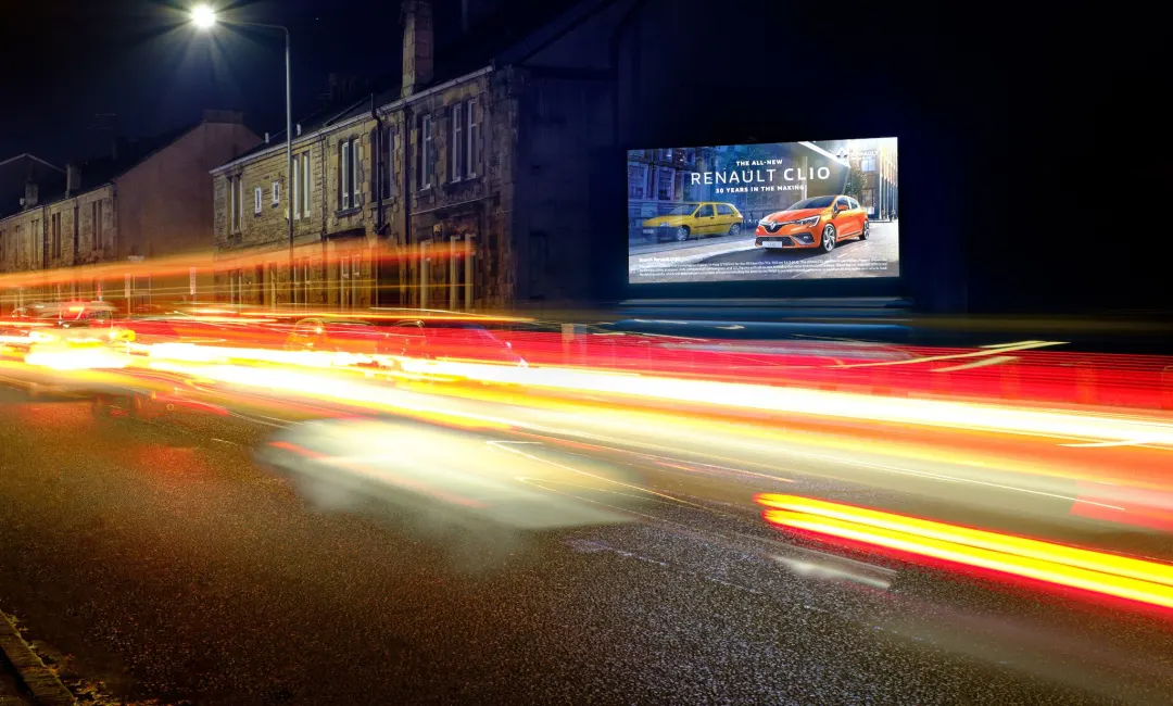
Visualise It in the Wild
Designing for OOH means thinking beyond the screen. What looks crisp on a laptop might fall flat on a six-sheet bus shelter or 48-sheet roadside panel.
Use mock-up tools like Clear Channel Playground to view your ad in real-world scenarios. Seeing how it looks in context can highlight potential improvements in contrast, composition, or copy clarity.
The Four Principles of OOH Poster Design
At Focus Media, we encourage creatives to think in terms of four core principles when developing OOH advertising assets:
✔️ Simple
✨ Striking
🧠 Succinct
🧭 Sensible
Here’s how they play out in practice:
✔️ Simple: Don’t Make People Work for It
The most effective posters are the clearest. A single headline, one compelling image, and one message is all you need. Anything more and your viewer may miss the point.
According to Talon’s Creative Canvas study, simplicity leads to stronger attention fixation. For DOOH campaigns, rotate variations of a core message instead of cramming it all into one frame. This approach also improves memory encoding—by up to 38%, says QMS.
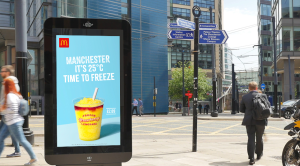
✨ Striking: Visuals That Capture on the Go
OOH ads compete with the noise of real life—so they need to pop.
Use:
-
High-quality lifestyle or product photography
-
Bold colours and big type
-
Ample negative space for visual breathing room
And remember: typography should be legible at distance and speed, especially for roadside formats. Visual hierarchy matters—make the headline the hero.
🧠 Succinct: Short Copy Wins
In the world of outdoor advertising, less is more. The faster someone understands your message, the more likely they are to remember it.
Posterscope research confirms that optimising copy length and logo size significantly increases brand recall and effectiveness. Aim for seven words or fewer and get straight to the point.
🧭 Sensible: Guide the Eye, Structure the Story
OOH design should follow natural reading patterns—left to right, top to bottom. Think about the visual journey:
-
Attract with a compelling image
-
Communicate with a strong, central headline
-
Associate with your logo or brand asset
This order helps build a mental map of your message—and makes it stick. For newer brands, enlarging the logo can also increase recognition and reinforce identity.
Bringing It All Together
OOH advertising thrives when strategy and creativity align. By focusing on clarity, composition, and real-world readability, your ads won’t just be seen—they’ll be remembered.
Ready to Go Live?
If you’re interested in booking standout placements—especially bus stop advertising—we’ve got you covered.
👉 Visit www.focusmediauk.com/bus-stop-advertising to get started.
Let me know if you want this version adapted for a case study, pitch deck, or email marketing content!